BAKED WITH MASTERY. A NEW EXPRESSION OF INDULGENCE.
Peek Freans has shaped the biscuit category in Pakistan for more than five decades, earning trust through consistency, quality and baking expertise. As indulgence and premiumisation increasingly redefine food brands globally, EBM saw an opportunity to create something new, not by abandoning its roots, but by using them as a platform to innovate. Phoenix Studios was engaged to define the brand strategy, create the name and develop the core identity for Piper’s Gold: a premium brand designed to stand confidently on the world stage.
Our work began with a clear ambition - to move beyond traditional category cues and create a brand that could signal modern indulgence, refinement and confidence. Category analysis revealed that the strongest foundation for this ambition already existed in the equity of the iconic Piper: a symbol of mastery, discipline and craft, recognised across generations. Rather than leaning on nostalgia, the opportunity was to reinterpret this mastery for a contemporary audience. This insight led to the creation of the name Piper’s Gold, designed to carry the authority of the Piper forward while signalling a richer, more elevated standard. Gold reflects substance rather than status - a reference to quality ingredients, baking excellence and the pursuit of a higher benchmark.
Conceived as a classic Phoenix Rise project, Piper’s Gold was built as a new brand with clarity and intent from day one. We developed a refined core identity system that balances confidence with restraint, creating a distinctive luxury expression capable of stretching across a broad and evolving portfolio. Designed as a disciplined masterbrand, the system establishes strong ownability and consistency while allowing the brand to evolve naturally across products, occasions and markets.
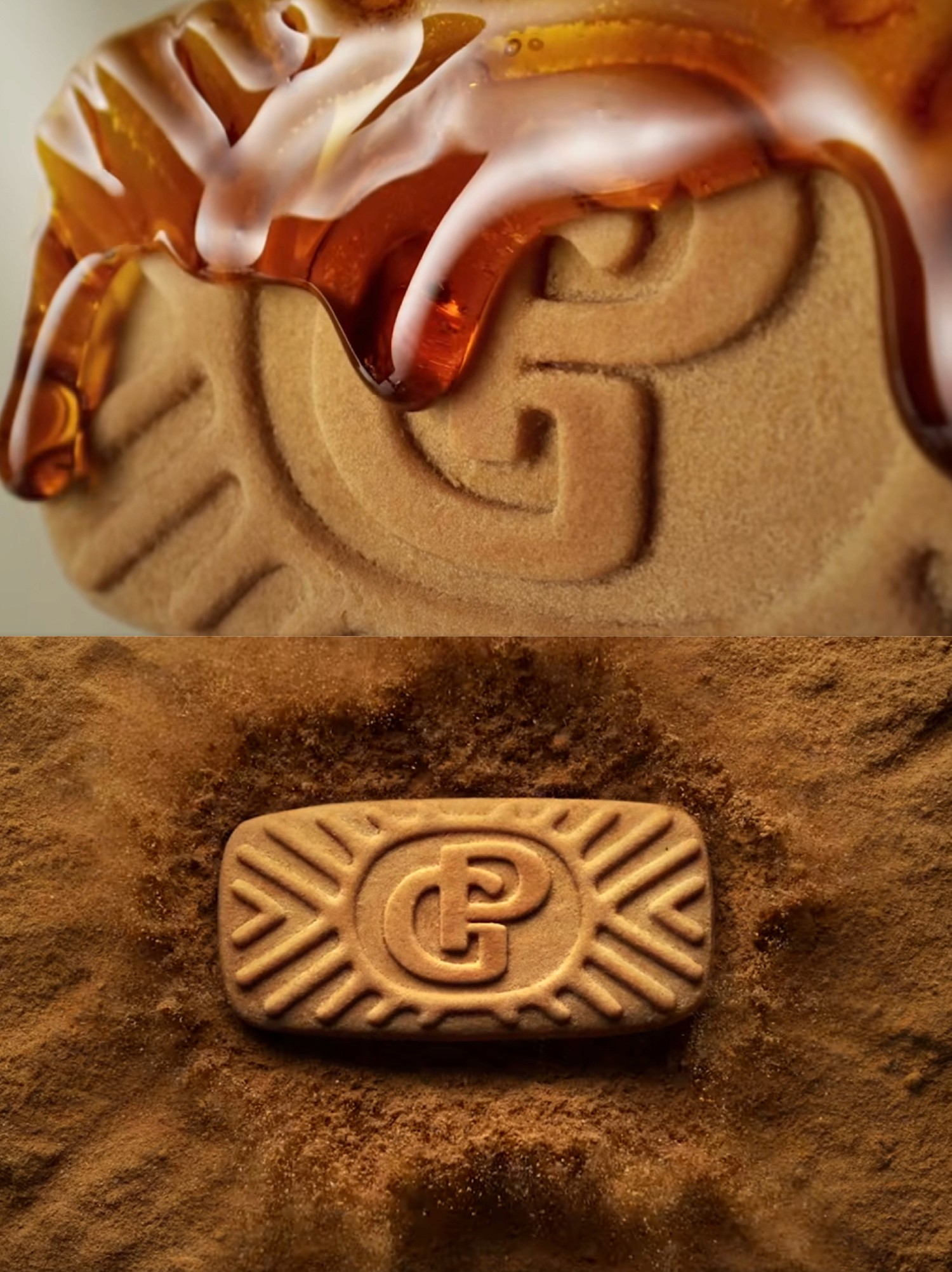
In a rare move for the category, the brand thinking extended all the way to the product itself. The iconic ‘PG’ monogram was embossed directly onto the biscuits, turning each piece into a branded artefact and reinforcing the idea that mastery underpins every detail of the experience. Piper’s Gold demonstrates how heritage can be used as a catalyst for innovation, how luxury is built through craft and clarity rather than excess, and how brands born in traditional categories can be confidently reimagined for a global, modern audience.